Liquid Multi-Column Layout with CSS
January 2011
This web site uses Cascading Style Sheets (CSS) to layout pages into columns. But unlike most sites on the Web today, the layout has been designed to be liquid: it flows to fill the browser window you choose, not some predetermined, fixed-width layout that cannot shrink or expand as you want it to.
In this article we look at how a simple, clean liquid layout can be coded in CSS, all in a way that's cross-browser compatible, and free of hacks, such as Java Script or faux columns.
The Equal-Height Column Problem
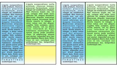
Two-column layouts. Left: unequal heights; right: equal heights.
An equal-height column layout has two, and often three, columns arranged side by side. If the columns all have the same background, it doesn't matter whether their content has different length, since you won't be able to see the difference in their lengths. But if the columns have individual background colours, it becomes obvious which columns are shorter: the underlying container background peeks through below them, as the figure shows.
Solving the equal-height column problem means making each column appear as if it were exactly the same height as it neighbours, regardless of its background colour. The added challenge is ensuring that this happens regardless of the window width and height chosen in the web browser, therefore keeping the layout liquid.
Previous Approaches
I've drawn much of my inspiration from Matthew James Taylor's
equal-height column layouts.
Taylor's approach neatly avoids cross-browser problems, and elegantly exploits the
power of CSS.
I've expanded on his scheme, but without use of overflow:hidden; because
I wanted none of my layout to spill out over the edges of my main content.
Taylor's key ideas, used here as well, are:
- A floated container div will always be the height of it's floated contents, therefore nested containers automatically scale to their contents.
- Horizontally offsetting nested div elements reveals the unique backgrounds of underlying, containing divs.
It's also worth reviewing the use of negative margins in CSS, as these assist in packing floating elements across the screen. Negative margins have been used in column layouts, such as the One True Layout, with good effect.
Construction of a Liquid Background Layer
We'll focus here on a two-column layout to keep things brief, but the concepts scale to three columns if necessary. First, we start by defining CSS for the browser body field and the bottom layer of our two background divs:
body {
   /* remove the border in old IE's */
   margin:0; padding:0; border:0;
   position:relative;
   background:gray;
}
#background2 {
   float:left;
   position:relative; left:2%;
   margin:0%; width:96%;
   background:skyblue;
}
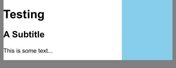
You can test this with some text inside the background2 div:
<body>
<div id="background2">
   <h1>Testing</h1>
   <h2>A Subtitle</h2>
   <p>This is some text...</p>
</div>
</body>
The browser should display a centred skyblue text area, surrounded by a gray background. We now want to add another background, a white background1, overlaying background2, but we make background1 just 70% of the width:
#background1 {
   float:left;
   position:relative; left:0%; width:70%;
   background:white;
}
Two background divs, background1 (white) overlaying background2 (skyblue).
We then nest the background1 div inside the background2 div. A screen-shot from a browser showing our text inside background1 might appear as in the figure.
Construction of the Content Layer
The nested background divs are only going to adjust to the height of their longest content column if we place the content into sibling containers (such as divs, adjacent to each other). We can start with the left column, inside its own div:
#column1 {
   float:left;
   /* allow 2% left and right margins */
   width:96%;
   position:relative; left:2%;
   padding:0; /* IE cannot handle padding properly, so none used */
   margin:1em 0 1em 0;
}
This allows the left column to appear inside a <div id="column1">
element, and appear as if it had a 2% left and right margin with respect to
background1.
However, we now face an interesting problem: there's nowhere for the right column to go!
Since we want the right column to appear overlaying the skyblue background2
we want a sibling div, column2, to float next to the left column, but it
won't, because we've already used 96% of the inner-most (background1) container.
The solution lies in understanding that browsers will only float elements adjacently if the
total width of those elements, after accounting for margins, does not exceed 100% of the
container's width.
So if column1 occupies already 96%, we must convince the browser that
both columns together are no more than 100% wide, or they won't float alongside.
Fortunately, we can do this without actually using narrow containers by the
magic of negative margins.
A negative left or right margin (or both) effectively cuts into the apparent content
width without changing its actual width because it allows adjacent elements to intrude
into its space.
But it does become possible to take a sizeable left column and make it appear to
occupy less than 96% width, and thus allow the right column to float where we want it to.
We could also have given column2 a negative left margin, and this would
work with most browsers except for IE6, which gets confused on the right shift step
to follow.
The final aspect of this trick is to shift the right column over to the right. Perhaps the easiest way of accomplishing this is to use the combination of right float and relative positioning, but relative to the right container edge. Again, negative values help us enormously, since we can use a negative right position in order to shift the whole column to the right of the container's right edge. The completed CSS for both left and right columns appears below:
#column1 {
   float:left;
   /* allow 2% left and right margins */
   width:96%;
   position:relative; left:2%;
   padding:0; /* IE cannot handle padding properly, so none used */
   /* cut right margin to allow column2 to float alongside */
   margin:1em -35.5% 1em 0;
}
#column2 {
   float:right;
   /* allow 2.5% left margin and 2% right margin */
   width:39%;
   /* use negative right pos to move column2 over its own background
      this works in IE6 as well!  Move by width + 2% margin */
   position:relative; right:-41%;
   padding:0; /* IE cannot handle padding properly, so none used */
   margin:1em 0 1em 0;
}
A little explanation of the maths is in order here.
Remember that background1 is only 70% the width of background2,
therefore the width of background2 in terms of background1
coordinates is 1/70% = 143%.
In other words, we want the right column to be 43% of the background1 width.
If we allow 2% left and right margins, that leaves a width of 39% for the
content inside column2.
Since we have to keep the apparent, floatable width of both columns at 100%
or less, we give the left column a negative right margin of 100%-96%-39% = -35%.
To ensure the total is strictly less than 100%, we use a -35.5% margin.
Finally, we position the right column right by -39%-2% = -41% to provide a 2%
effective left margin for its content.
Summary
A final copy of this simple two-column layout can be seen here. Use your browser's source viewer to see the CSS and test HTML. This solution appears to display correctly across several browsers, including Firefox, IE, and Safari, as far as I'm aware.
At one level, it's disappointing that an equal-height layout is this difficult with CSS, particularly if we want a liquid layout. However, by use of some basic concepts, such as nesting containers, floated divs, negative margins, and relative positioning, we can achieve an equal-height column layout that is genuinely liquid, is light on the hacks, and cross-browser compatible.